Contents
- Key plugin features
- Demo
- Installation
- Subscription activation
- Plugin FAQ
- Getting started
- Product page, cart, and order
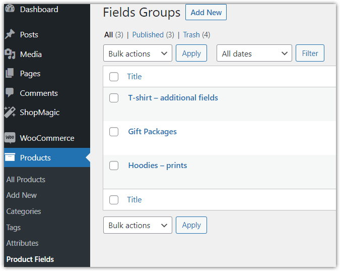
- Field groups list
- Field group configuration
- Support for WooCommerce Blocks
- Individual field types
- Option fields
- Picker fields
- Other fields
- Integrations with other WP Desk plugins
- Options for advanced users
- Extra help
- Free vs. PRO Feature Comparison
- Worth reading
Key plugin features
- creating field groups and assigning them to products, variations, categories, tags, or all products,
- support for text fields, selection lists, radio fields, checkboxes, dates, times, colors, images, and files,
- setting required fields, default values, tooltips, and custom CSS classes,
- adding fixed or percentage-based prices to fields and individual options,
- defining the price calculation method — for each product item, as a one-time fee, or based on the unit quantity from the Flexible Quantity plugin,
- showing fields based on conditional logic, meaning the customer's previous selections,
- setting the order of groups and duplicating ready-made configurations.
Flexible Product Fields lets you add extra fields to WooCommerce products. The customer completes the fields or selects available options before adding the product to the cart. The selected values can be saved in the cart and order, and they can affect the product price.
The plugin can be useful, among other cases, when selling personalized products, engravings, prints, sets with optional add-ons, products that require a file upload or date selection, and simple product configurators.
Demo
On the demo page, you can check how the PRO versions of our plugins work before purchase. You only need a valid email address to create a test account.
Installation
Subscription activation
Plugin FAQ
✅ Flexible Product Fields FAQ →
Getting started
The plugin supports the following products:
- simple
- variable
- grouped
- external/affiliate
- drafts
Flexible Product Fields configuration is based on creating groups of additional fields displayed on the product page.
The product must have a price set for the fields to appear on its page.
You can assign many groups to one product. Each group can be assigned to a specific product or product category.
You will find the plugin settings in Products → Product Fields.
To add a new group, click Add New next to the Field groups heading.
Product page, cart, and order
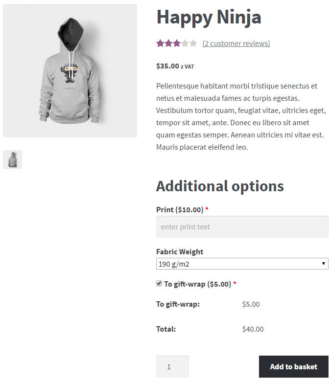
All added fields will appear on the product page in the selected section and in the configured order.
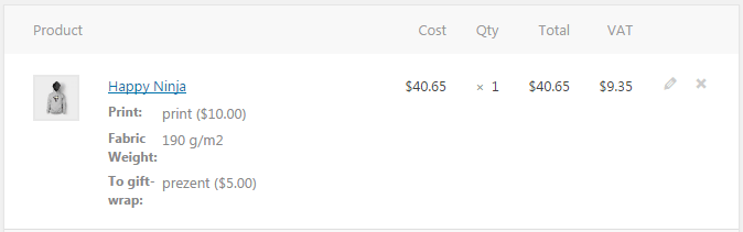
Additional options selected by the customer will be displayed in the cart and checkout form in a similar way to variation attributes. The product price will include the base product price and the prices of the selected options.
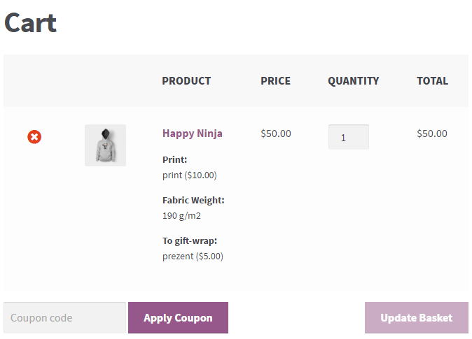
Templates with a price rule are an exception. Depending on the selected calculation method, the price of an additional option may be visible in the cart or only in the order summary. If you choose an additional fee added to the product price, the price will be displayed only in the order summary. However, the options selected by the customer will already be visible in the cart, as in the example above.
Additional fields will also appear in the order summary and order edit screen.
Field groups list
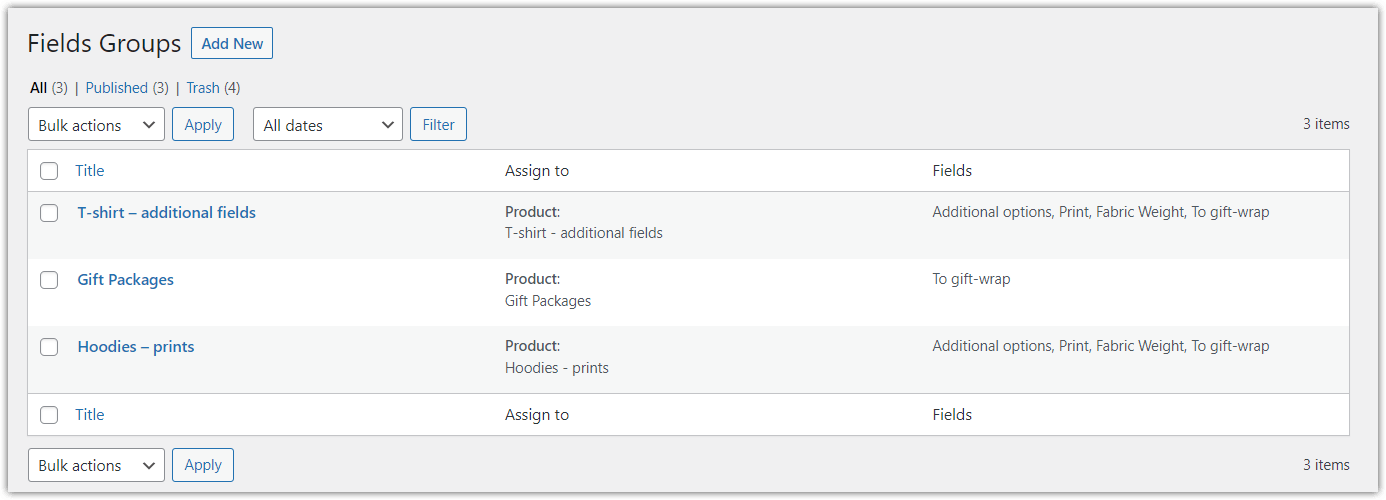
The field groups list lets you browse configured and active groups, as well as edit, duplicate, delete, and search them. The table contains the following information:
Title
The group title is used only to identify the group by the administrator.
Assign to
This column shows which products or categories the group has been assigned to.
Fields
This column contains the names of all fields used in the field group.
To hide unnecessary columns, click Screen Options in the upper-right corner and select the table columns.
Edit
To edit a group, click its title. You can also hover over the title and click Edit in the quick links menu.
PRO Duplicate
You can create copies of configured groups. Hover over the title and click Duplicate in the quick links menu. The plugin will create a copy of the selected field group.
Delete
You can delete groups one by one using quick links or in bulk. To delete several groups, select them and then choose Bulk actions → Move to Trash.
To permanently delete groups, select the Trash filter and then choose Delete permanently.
Search
To search for a group, enter its title in the field in the upper-right corner and click Search field groups.
You can also filter groups by status: Published, Drafts (inactive groups), and Trash.
Field group configuration
To add a new field group, click New field group in the upper-left corner.
Enter the group title. It will be visible only to the store administrator.
After configuring the fields, save the settings by clicking Publish.
Settings
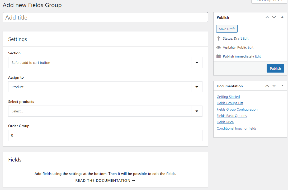
The Settings metabox contains options for the entire group.
Section
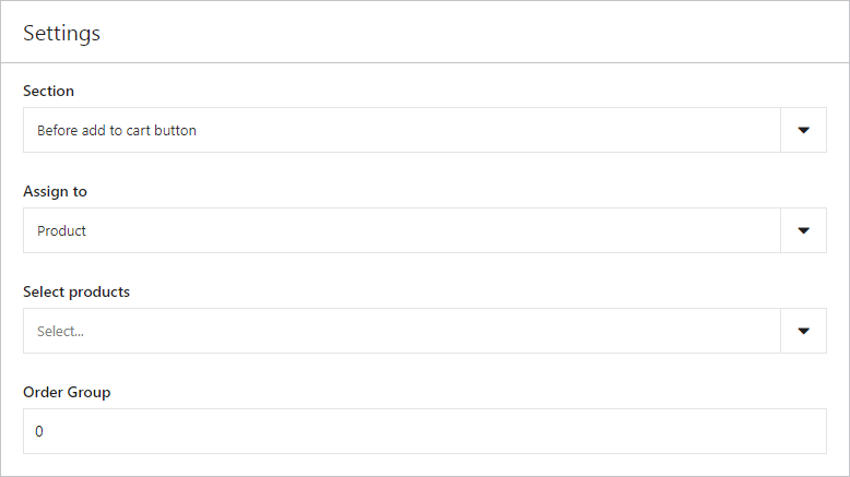
Select the section of the product page where the fields will be displayed. You can choose one of two sections:
- before the “Add to cart” button,
- after the “Add to cart” button.
Read about it here ↓
Assign group to
Additional fields can be assigned to:
- selected products,
- PRO selected product variations,
- PRO selected categories,
- PRO selected tags,
- PRO all products.
After choosing one of the options, search for a product, category, or tag in the Select... field. You can add many products, categories, or tags to one field group.
PRO Group order
If you want to add several field groups to one product, set the order in which they will be displayed.
By default, in the free version, fields are displayed in the order in which groups were created.
Support for WooCommerce Blocks
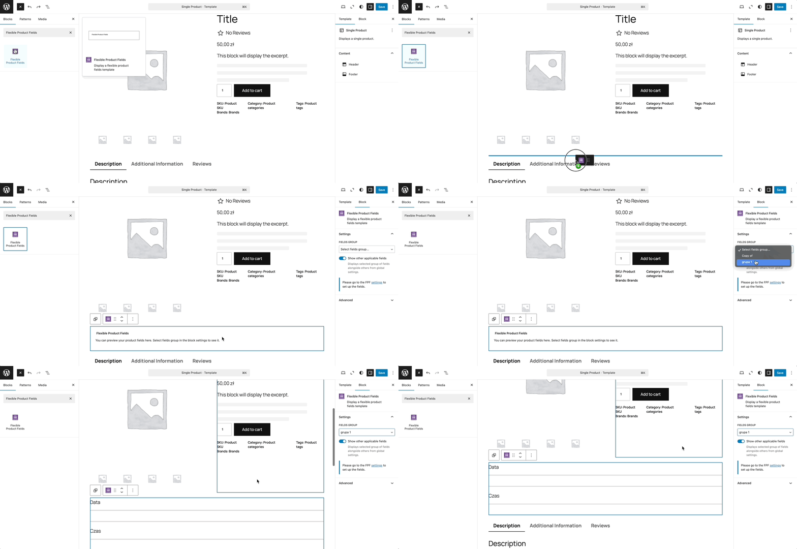
Flexible Product Fields lets you add a field group using the theme block editor. Go to Appearance → Editor. You can also open the editor by adding the path /wp-admin/site-editor.php to your store domain address.
Fields
In the Fields metabox, you can add fields displayed on the product page.
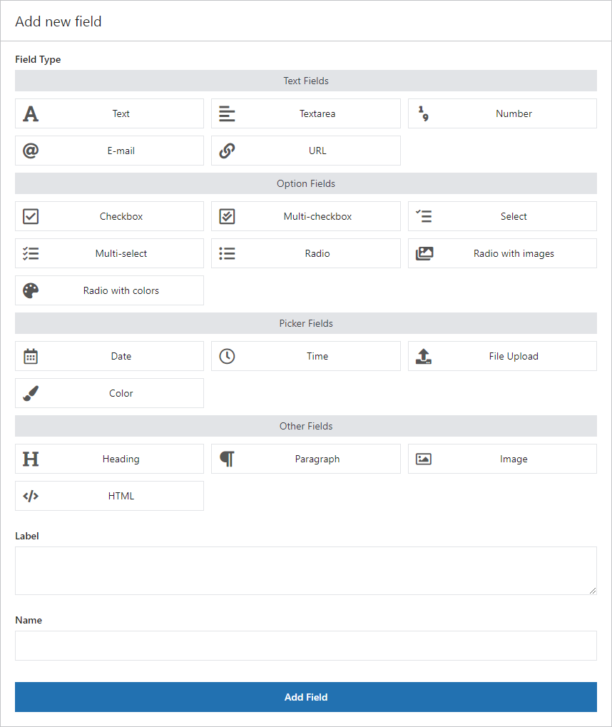
You can sort fields using drag and drop, edit them by clicking the field bar, and delete them using the Delete field option.
Basic options
Depending on the selected field type, different configuration options will be available.
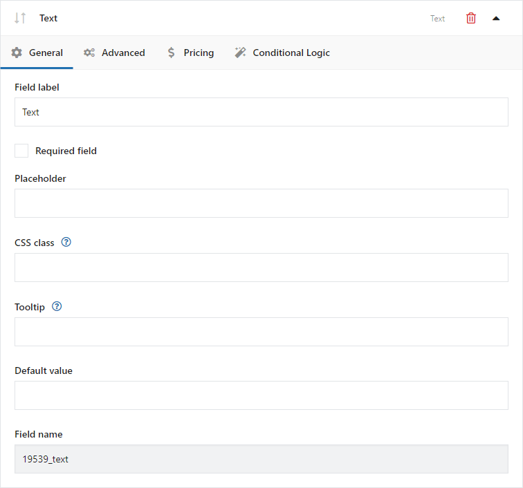
Field label
The field name displayed on the product page.
Required field
Selecting this option enables field validation on the product page. If the customer does not complete the field, they will see an error message and will not be able to add the product to the cart.
If the field is required, an “*” will appear next to its name on the field bar.
Placeholder
Text displayed in the field before the customer enters content.
CSS class
You can modify the appearance of fields on the product page by adding your own class name.
Tooltip
Description displayed when the cursor hovers over the [?] icon next to the field label.
PRO Default value
Enter the option value to set it as default.
Prices
The plugin lets you increase or decrease the base product price (set in WooCommerce) by the value assigned to a given field.
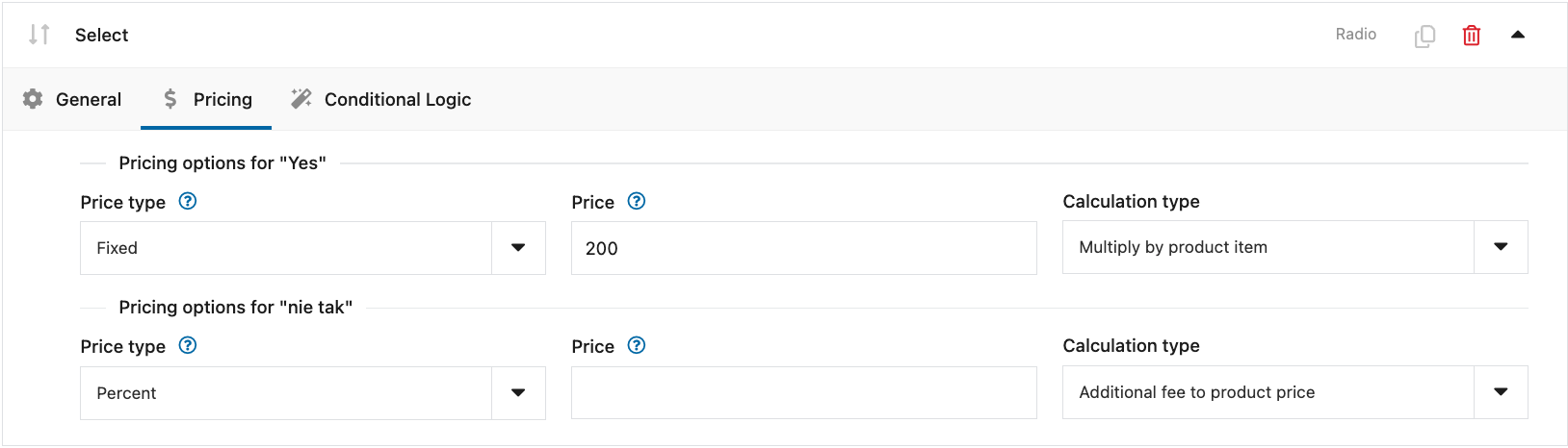
PRO Price type
For selected field types, you can add prices that will be added to the product price. You can choose how the price for an additional option is calculated:
- Fixed amount — set a fixed price for the option;
- Percentage — set a percentage of the product price for the option.
PRO Price
Depending on the selected price type, enter an amount in the store currency or a percentage value used to calculate the product price.
PRO Price calculation method
- Multiplied by product quantity — the field price will be multiplied by the number of product items;
- Additional fee added to product price — the field price will be added once to the product price;
- Based on unit quantity (Flexible Quantity) — the field price will be multiplied by the measurement value passed by Flexible Quantity.
The plugin is compatible with several popular currency switchers:
- Multi Currency for WooCommerce
- Currency Switcher for WooCommerce
- WooCommerce Currency Switcher
Thanks to this, the price assigned to the field will change together with the store currency.
Conditional logic for fields
PRO Conditional logic lets you display any field in a group based on options selected in the following field types:
- Checkbox
- Select
- Radio
- Radio with images
- Radio with colors
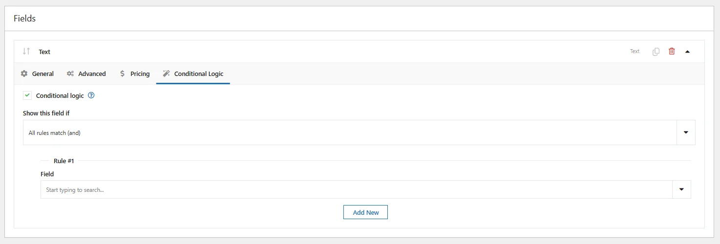
Choose how rules are checked:
- all rules are met (and),
- one or more rules are met (or).
Then add a rule, and select a field and condition:
- is equal to,
- is different from.
For the Checkbox field, the available options will be Checked or Unchecked.
For other fields, the available values will be the values defined for that field.
You can add any number of rules. When the rules are met, the action for the given field will be triggered.
Individual field types
Text fields
Text (input)
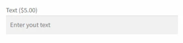
Field appearance on the product page:
Field configuration:
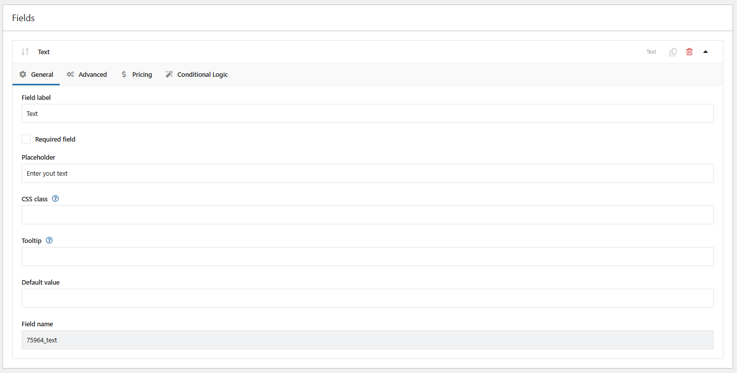
Field label
The field name displayed on the product page.
Required field
Selecting this option enables field validation on the product page. If the customer does not complete the field, they will see an error message and will not be able to add the product to the cart.
If the field is required, an “*” will appear next to its name on the field bar.
Placeholder
Text displayed in the field before the customer enters content.
CSS class
You can modify the appearance of fields on the product page by adding your own class name.
Tooltip
Description displayed when the cursor hovers over the [?] icon next to the field label.
PRO Default value
Enter the option value to set it as default.
Character limit
For the Text and Textarea fields, you can set the maximum number of characters that can be entered on the product page.
Textarea
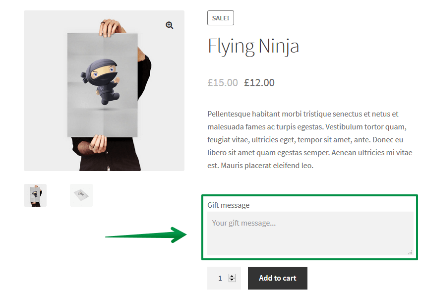
Field appearance on the product page:
Configuration:
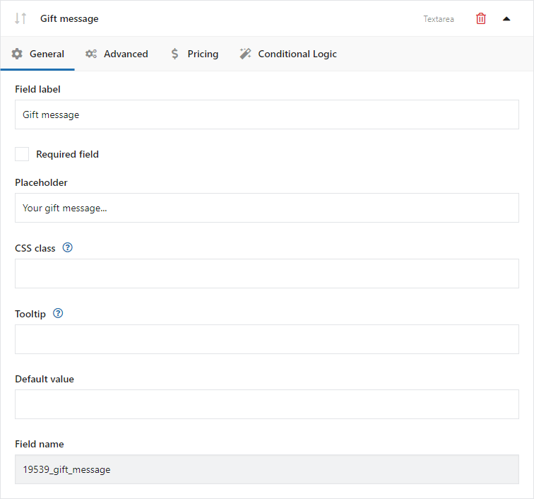
Configuration for this field includes the same basic options as the Text (input) field: field label, required field, placeholder, CSS class, tooltip, default value, and character limit.
Number
Field appearance on the product page:

Field configuration:
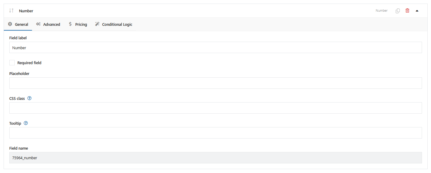
Field label
The field name displayed on the product page.
Required field
Selecting this option enables field validation on the product page.
Placeholder
Text displayed in the field before the customer enters content.
CSS class
You can modify the appearance of fields on the product page by adding your own class name.
Tooltip
Description displayed when the cursor hovers over the [?] icon next to the field label.
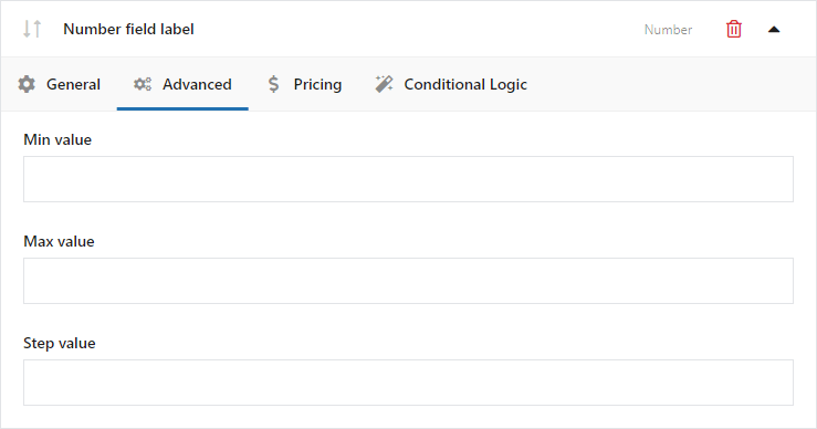
Minimum value
Values below the minimum value will be rejected by field validation.
Maximum value
Values above the maximum value will be rejected by field validation.
Step value
The interval between consecutive accepted values.
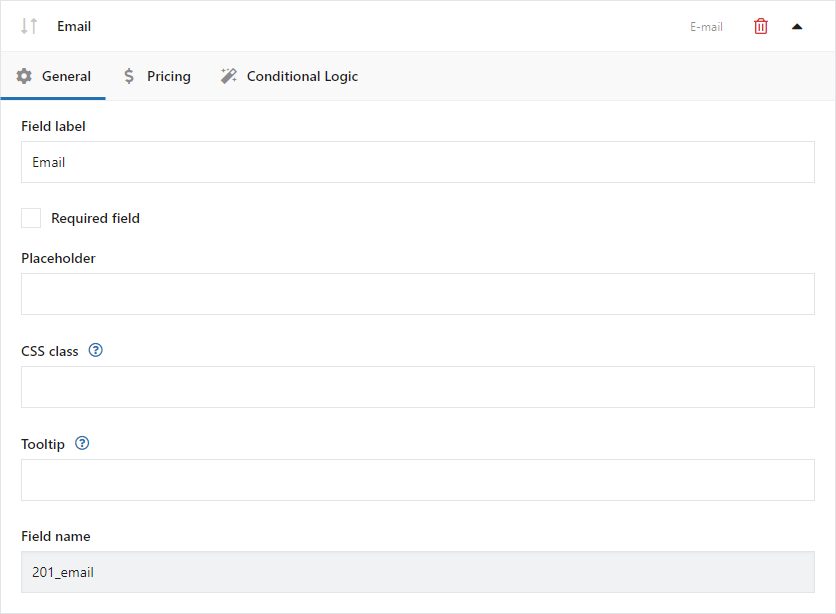
Field configuration includes: field label, required field, placeholder, CSS class, and tooltip. The field validates the email address entered by the customer.
Configuration:
URL
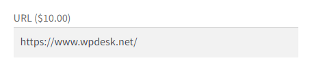
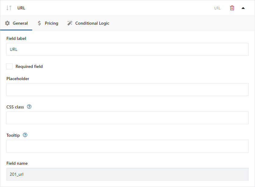
Field configuration includes: field label, required field, placeholder, CSS class, and tooltip. The field validates the URL entered by the customer.
Example of the field type on the product page:
Configuration:
Option fields
Checkbox
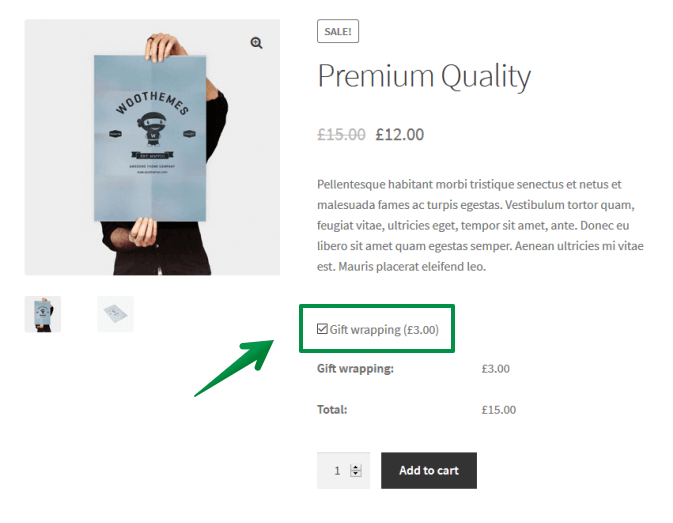
Example of the field type on the product page:
Configuration:
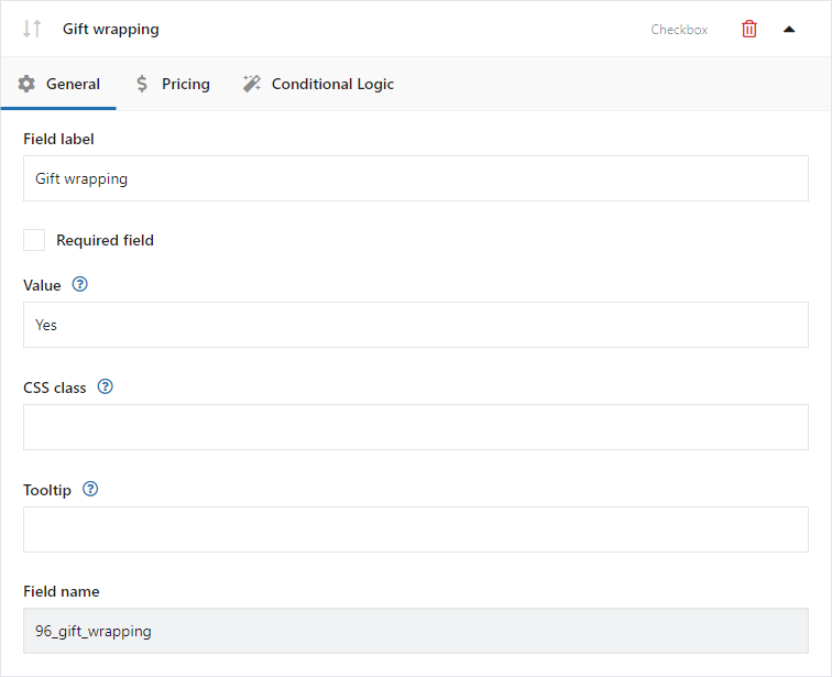
Field label
The field name displayed on the product page.
Required field
Selecting this option enables field validation on the product page.
Checked by default
Select this option to make the checkbox selected by default.
Value
The entered value is visible only to the store administrator and is displayed, for example, on the order edit page if the customer selects this option.
CSS class
You can modify the appearance of fields on the product page by adding your own class name.
Tooltip
Description displayed when the cursor hovers over the [?] icon next to the field label.
Toggle
The Toggle field includes the same basic settings as Checkbox. You can also set the label displayed when the field is selected.

Configuration:
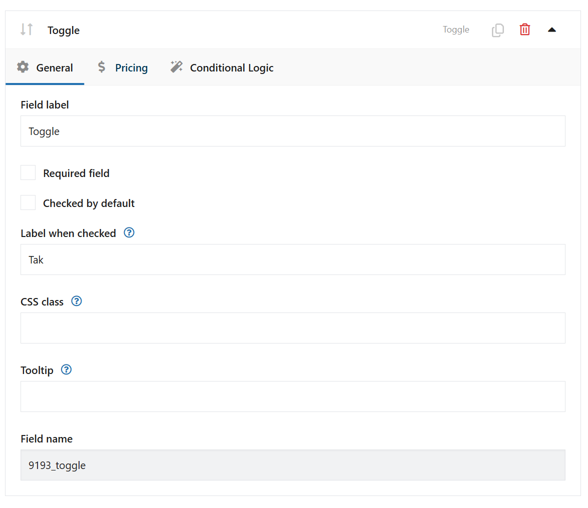
Field label
The field label will appear on the product page.
Required
Checking this option will make the field required. If the field is not completed by the client, an error message appears and he cannot add a product to the cart.
If the field is required, an asterisk "*" will appear next to its name.
Checked by default
Select this option to have the toggle in the 'on' position by default.
Label when checked
Enter the text that will appear next to the label when the user selects this field. The text will be visible, e.g. in the Cart, instead of the selected box.
CSS Class
You can modify the appearance of the fields on the product page by adding your own CSS class.
Tooltip
The description will appear when the user hovers the cursor over the [?] icon next to the field label.
Multi-checkbox
Field configuration includes field label, required field, option value, option label, checked by default, CSS class, tooltip, minimum number of selected values, and maximum number of selected values.
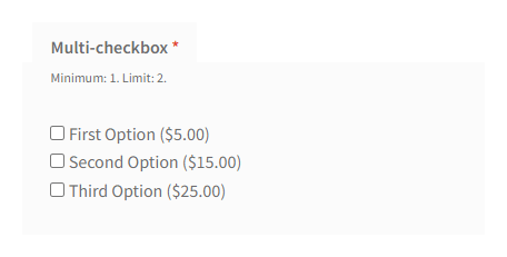
Example of the field type on the product page:
Configuration:
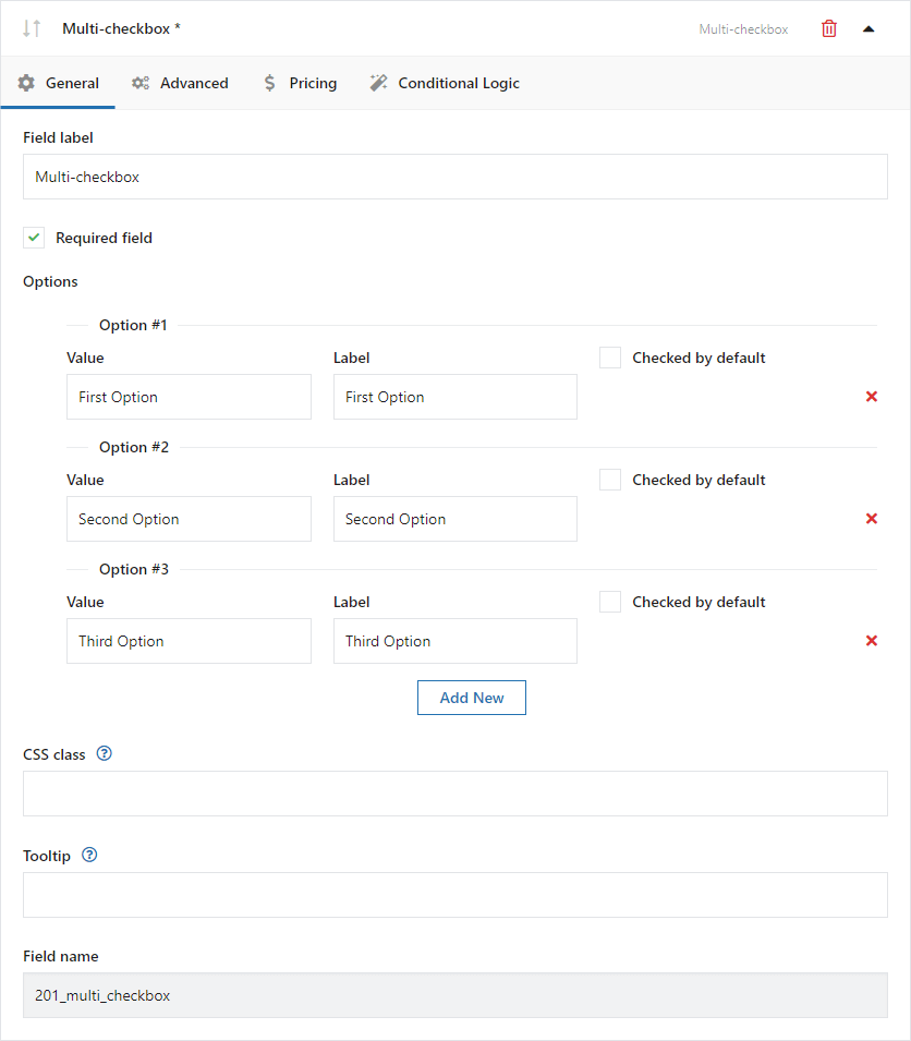
Field label
The field label will appear on the product page.
Required
Checking this option will make the field required. If the field is not completed by the client, an error message appears and he cannot add a product to the cart.
If the field is required, an asterisk "*" will appear next to its name.
Value
The entered value is only visible for store admin and displays i.e. in the order edit page if the customer selects that option.
Label
The option label will appear on the product page.
Checked by default
Select this option to have the checkbox checked by default.
CSS Class
You can modify the appearance of the fields on the product page by adding your own CSS class.
Tooltip
The description will appear when the user hovers the cursor over the [?] icon next to the field label.
Minimum of selected values
Set the minimum number of selections required. Check the "Required field" option in the "General" tab for the following setting to work.
Maximum number of selected values
Set the maximum number of selections allowed.
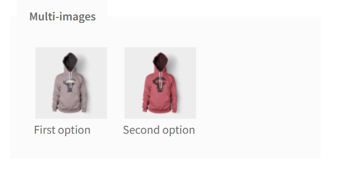
Multi-images
Field configuration includes field label, required field, option value, option label, checked by default, CSS class, tooltip, minimum number of selected values, maximum number of selected values, and single item width in pixels.
Example of the field type on the product page:
Configuration:
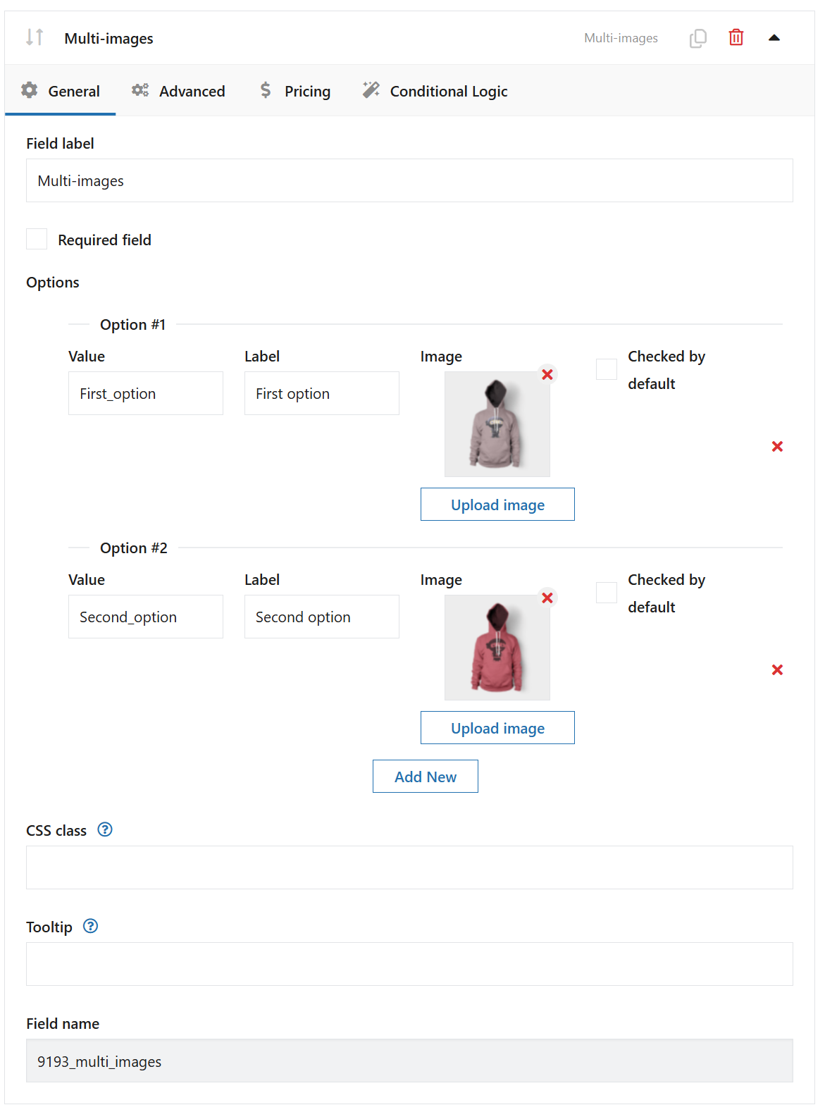
Field label
The field label will appear on the product page.
Required
Checking this option will make the field required. If the field is not completed by the client, an error message appears and he cannot add a product to the cart.
If the field is required, an asterisk "*" will appear next to its name.
Value
The entered value is only visible for store admin and displays i.e. in the order edit page if the customer selects that option.
Label
The option label will appear on the product page.
Checked by default
Select this option to have the checkbox checked by default.
CSS Class
You can modify the appearance of the fields on the product page by adding your own CSS class.
Tooltip
The description will appear when the user hovers the cursor over the [?] icon next to the field label.
Advanced:
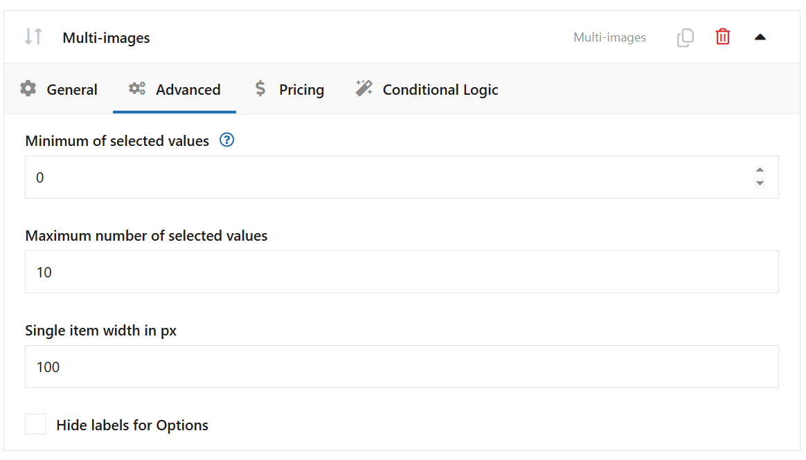
Minimum of selected values
Set the minimum number of selections required. Check the "Required field" option in the "General" tab for the following setting to work.
Maximum number of selected values
Set the maximum number of selections allowed.
Single item width in px
Set the width of the single image.
Select
Field configuration includes field label, required field, placeholder, CSS class, tooltip, option value, option label, image, and default value.
Example of the field type on the product page:
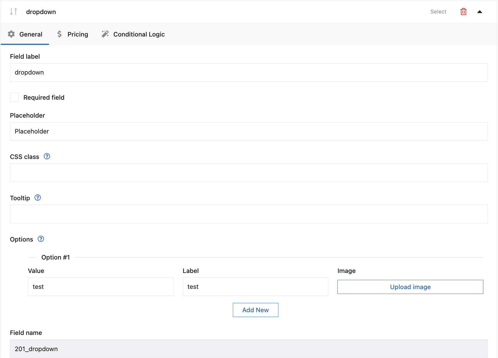
Configuration:
Field label
The field label will appear on the product page.
Required
Checking this option will make the field required. If the field is not completed by the client, an error message appears and he cannot add a product to the cart.
If the field is required, an asterisk "*" will appear next to its name.
Placeholder
The description will appear as the first option to choose from a dropdown list (e.g. "Select from list"). The option will be inactive and not clickable.
CSS Class
You can modify the appearance of the fields on the product page by adding your own CSS class.
Tooltip
The description will appear when the user hovers the cursor over the [?] icon next to the field label.
Value
The entered value is only visible for store admin and displays i.e. in the order edit page if the customer selects that option.
Label
The option label will appear on the product page.
Image
An image that will be associated with a field value and displayed in the product gallery when the value is selected.
PRO Default value
Enter the value of the option to be set as default.
Multi-select
Example of the field type on the product page:
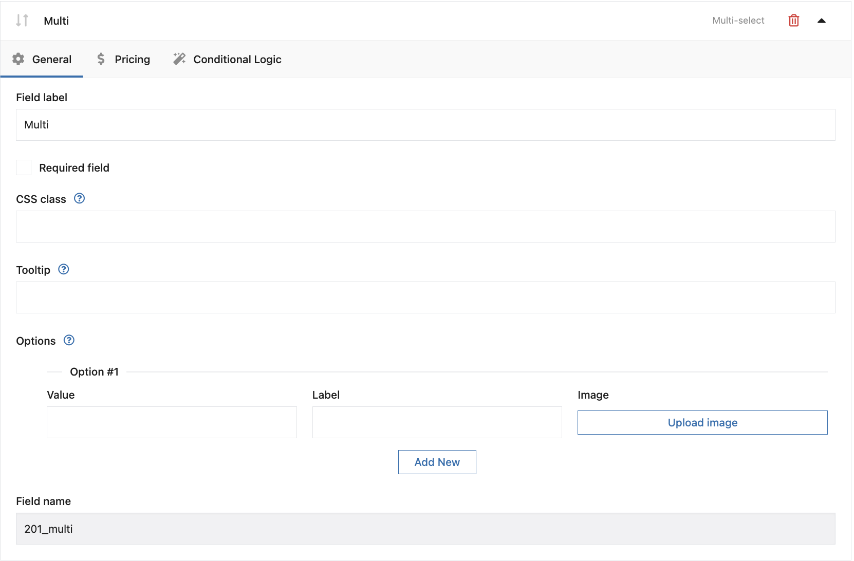
Configuration:
Field label
The field label will appear on the product page.
Required
Checking this option will make the field required. If the field is not completed by the client, an error message appears and he cannot add a product to the cart.
If the field is required, an asterisk "*" will appear next to its name.
CSS Class
You can modify the appearance of the fields on the product page by adding your own CSS class.
Tooltip
The description will appear when the user hovers the cursor over the [?] icon next to the field label.
Value
The entered value is only visible for store admin and displays i.e. in the order edit page if the customer selects that option.
Label
The option label will appear on the product page.
Image
An image that will be associated with a field value and displayed in the product gallery when the value is selected.
Field configuration includes field label, required field, CSS class, tooltip, option value, option label, and image.
Radio
Field configuration includes field label, required field, CSS class, tooltip, option value, option label, and default value.
Example of the field type on the product page:
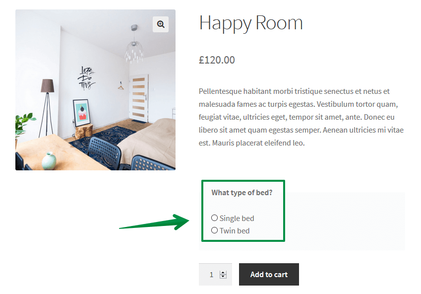
Configuration:
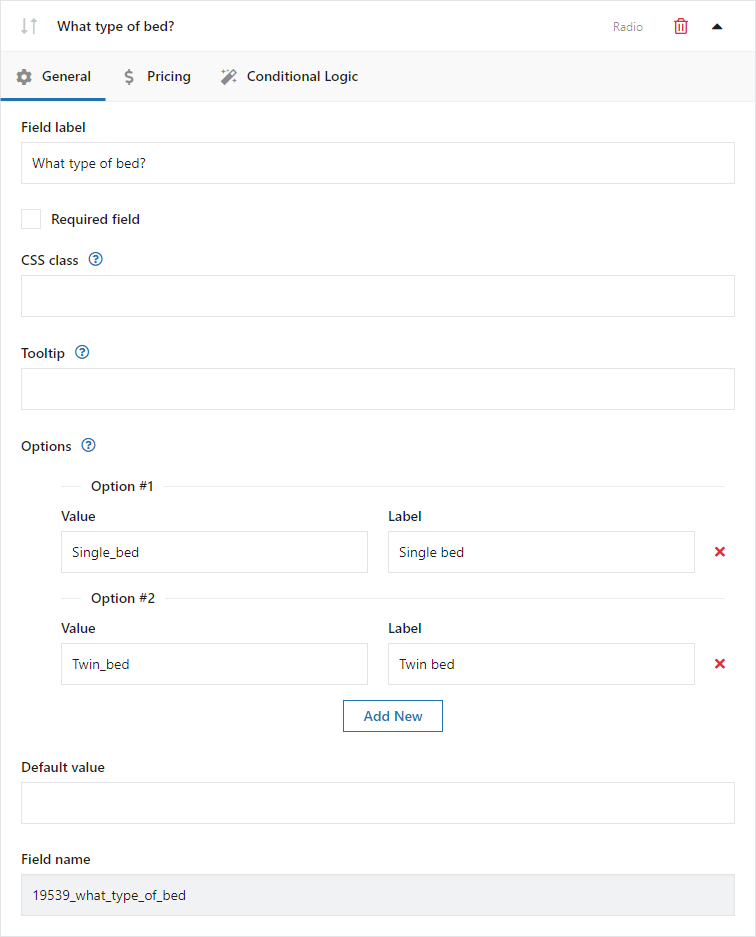
Field label
The field label will appear on the product page.
Required
Checking this option will make the field required. If the field is not completed by the client, an error message appears and he cannot add a product to the cart.
If the field is required, an asterisk "*" will appear next to its name.
CSS Class
You can modify the appearance of the fields on the product page by adding your own CSS class.
Tooltip
The description will appear when the user hovers the cursor over the [?] icon next to the field label.
Value
The entered value is only visible for store admin and displays i.e. in the order edit page if the customer selects that option.
Label
The option label will appear on the product page.
PRO Default value
Enter the value of the option to be set as default.
Radio with images
Field configuration includes field label, required field, CSS class, tooltip, option value, option label, uploaded image, and default value.
Example of the field type on the product page:
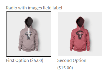
Configuration:
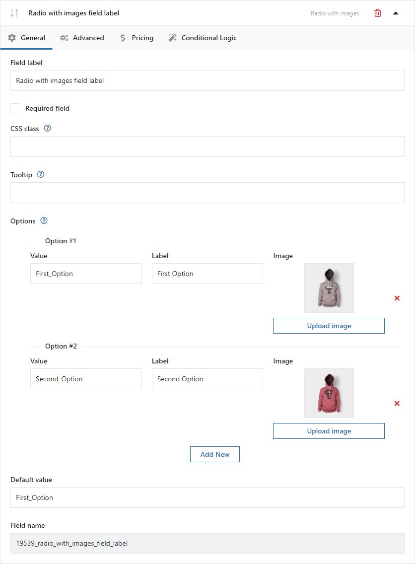
Field label
The field label will appear on the product page.
Required
Checking this option will make the field required. If the field is not completed by the client, an error message appears and he cannot add a product to the cart.
If the field is required, an asterisk "*" will appear next to its name.
CSS Class
You can modify the appearance of the fields on the product page by adding your own CSS class.
Tooltip
The description will appear when the user hovers the cursor over the [?] icon next to the field label.
Value
The entered value is only visible for store admin and displays i.e. in the order edit page if the customer selects that option.
Label
The option label will appear on the product page.
Upload Image
This button adds an image (thumbnail 150 x 150).
PRO Default value
Enter the value of the option to be set as default.
Radio with colors
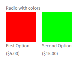
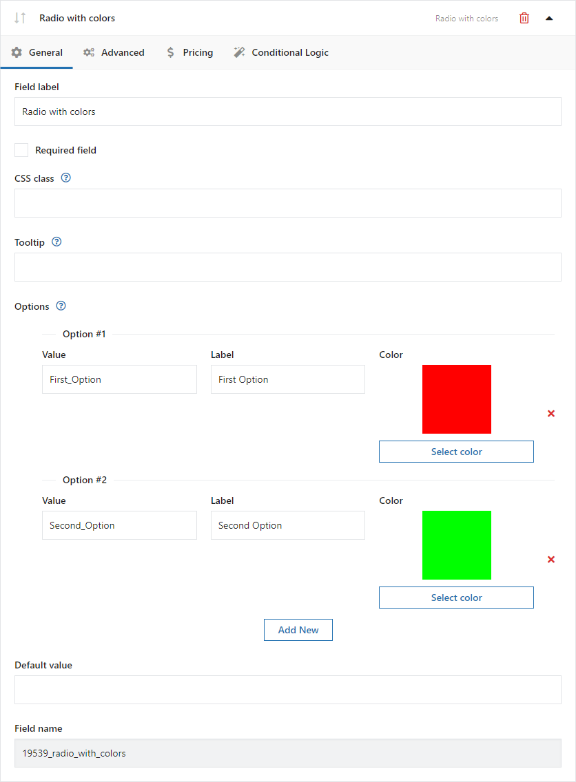
Field configuration includes field label, required field, CSS class, tooltip, option value, option label, color, and default value.
Example of the field type on the product page:
Configuration:
Field label
The field label will appear on the product page.
Required
Checking this option will make the field required. If the field is not completed by the client, an error message appears and he cannot add a product to the cart.
If the field is required, an asterisk "*" will appear next to its name.
CSS Class
You can modify the appearance of the fields on the product page by adding your own CSS class.
Tooltip
The description will appear when the user hovers the cursor over the [?] icon next to the field label.
Value
The entered value is only visible for store admin and displays i.e. in the order edit page if the customer selects that option.
Label
The option label will appear on the product page.
Color
Click this button to select a color using a picker.
PRO Default value
Enter the value of the option to be set as default.
Picker fields
Date
Field configuration:
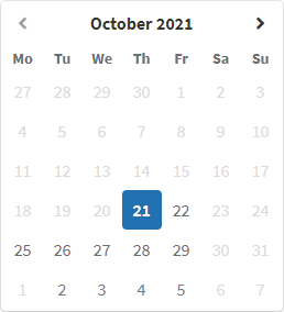
Example of the field type on the product page:
Configuration:
Field label
The field name displayed on the product page.
Required field
Selecting this option enables field validation on the product page.
Placeholder
Text displayed in the field before the customer enters content.
CSS class
You can modify the appearance of fields on the product page by adding your own class name.
Tooltip
Description displayed when the cursor hovers over the [?] icon next to the field label.
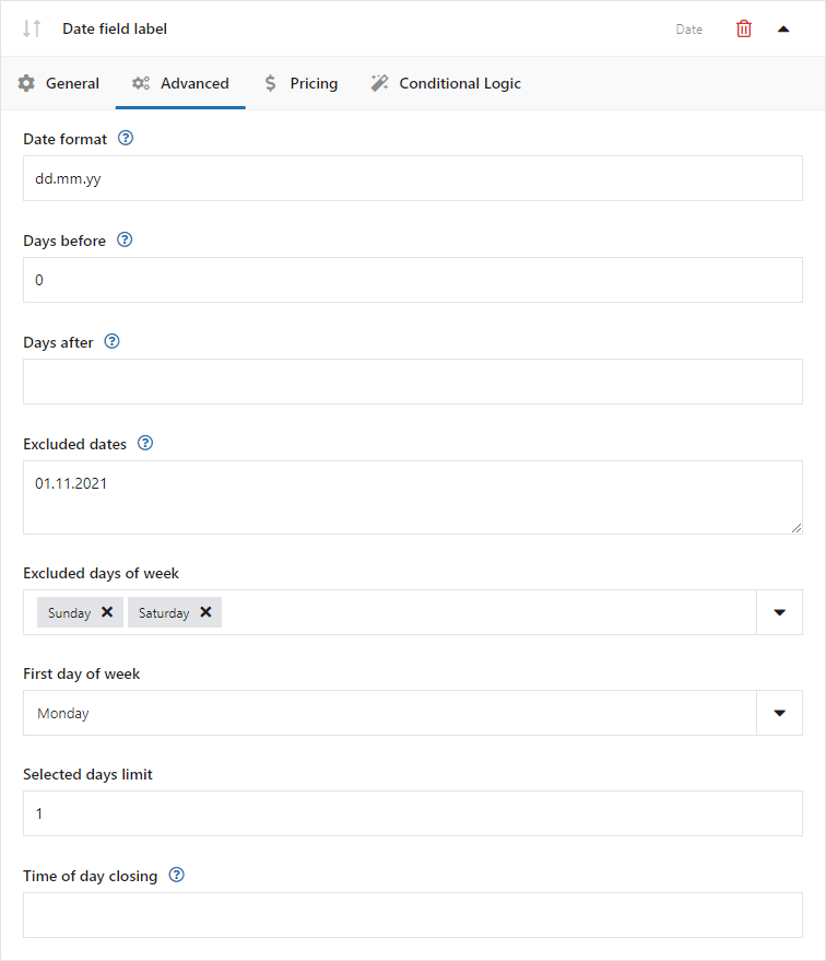
Date format
Default date format: dd.mm.yy, for example 01.01.2021.
Days before
Range of days available in the calendar before the current date. Enter 0 to exclude past dates from the calendar.
Days after
Range of days available in the calendar after the current date.
Excluded dates
Specific dates unavailable in the calendar, for example non-working days. Separate dates with commas and use the WordPress date format, for example dd.mm.yy.
Excluded weekdays
Days of the week unavailable in the calendar, for example weekends.
First day of week
The day of the week shown first in the calendar, for example Monday.
Selected days limit
The maximum number of days available for selection in the calendar.
Day closing time
The closing time of the day, for example 15:00. Selecting the current date will not be possible after this time is exceeded.
Time
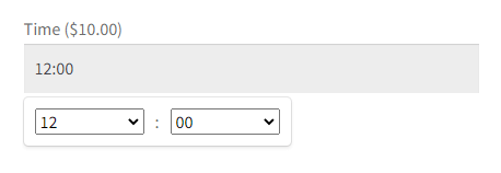
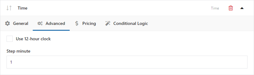
Field configuration includes field label, required field, placeholder, CSS class, tooltip, 12-hour clock mode, and minute step.
Example of the field type on the product page:
Configuration:
Field label
The field label will appear on the product page.
Required
Checking this option will make the field required. If the field is not completed by the client, an error message appears and he cannot add a product to the cart.
If the field is required, an asterisk "*" will appear next to its name.
Placeholder
The placeholder will appear as a help inside the field.
CSS Class
You can modify the appearance of the fields on the product page by adding your own CSS class.
Tooltip
The description will appear when the user hovers the cursor over the [?] icon next to the field label.
Use 12-hour clock
Check this checkbox to switch the clock to 12-hour (AM/PM) mode.
Step minute
Enter a value between 1 and 60 to set an interval between minutes to choose from the list.
File upload
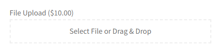
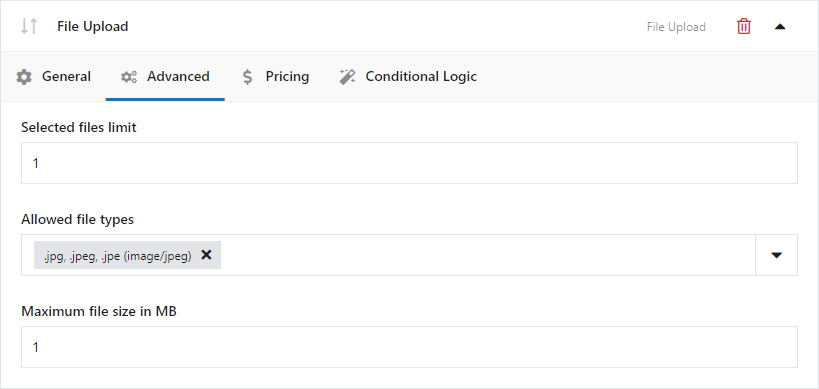
Field configuration includes field label, required field, CSS class, tooltip, selected files limit, allowed file types, and maximum file size in MB.
Example of the field type on the product page:
Configuration:
Field label
The field label will appear on the product page.
Required
Checking this option will make the field required. If the field is not completed by the client, an error message appears and he cannot add a product to the cart.
If the field is required, an asterisk "*" will appear next to its name.
CSS Class
You can modify the appearance of the fields on the product page by adding your own CSS class.
Tooltip
The description will appear when the user hovers the cursor over the [?] icon next to the field label.
Selected files limit
Set the limit of files available for upload.
Allowed file types
Select the file extensions available for upload.
Maximum file size in MB
Set the allowed file size available for upload.
Color
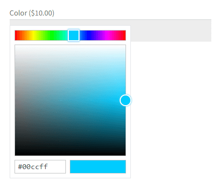
Field configuration includes field label, required field, placeholder, CSS class, tooltip, and default value.
Example of the field type on the product page:
Configuration:
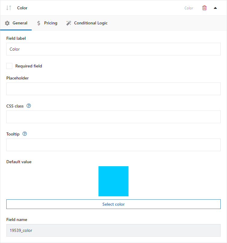
Field label
The field label will appear on the product page.
Required
Checking this option will make the field required. If the field is not completed by the client, an error message appears and he cannot add a product to the cart.
If the field is required, an asterisk "*" will appear next to its name.
Placeholder
The placeholder will appear as a help inside the field.
CSS Class
You can modify the appearance of the fields on the product page by adding your own CSS class.
Tooltip
The description will appear when the user hovers the cursor over the [?] icon next to the field label.
PRO Default value
Enter the value of the option to be set as default.
Other fields
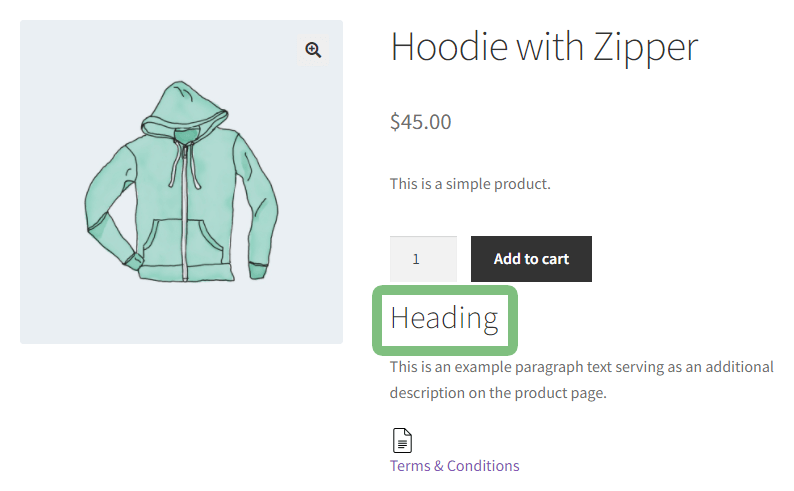
Heading
Example of the field type on the product page:
Configuration:
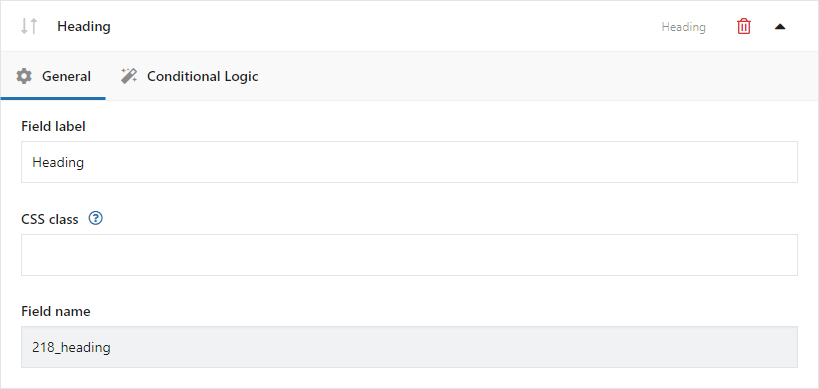
Field label
The field label will appear on the product page.
CSS Class
You can modify the appearance of the fields on the product page by adding your own CSS class.
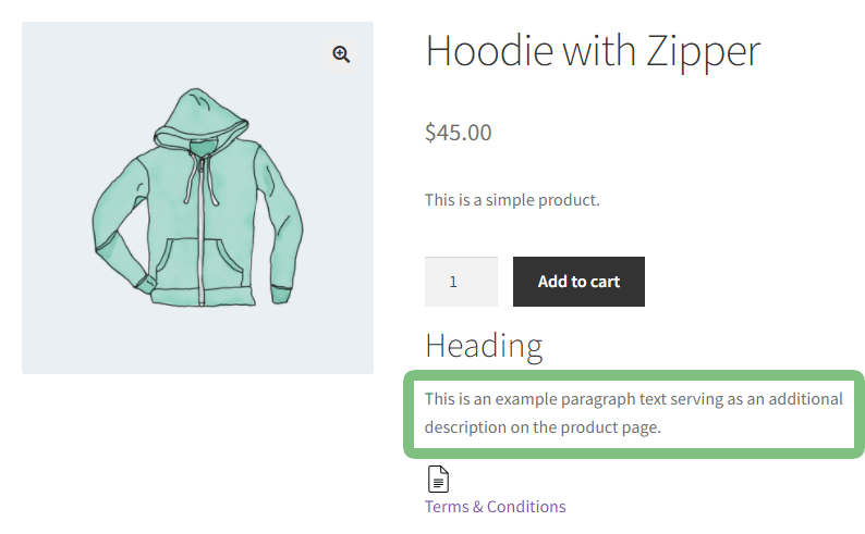
Paragraph
Example of the field type on the product page:
Configuration:
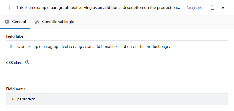
Field label
The field label will appear on the product page.
CSS Class
You can modify the appearance of the fields on the product page by adding your own CSS class.
Image
Example of the field type on the product page:
Configuration:
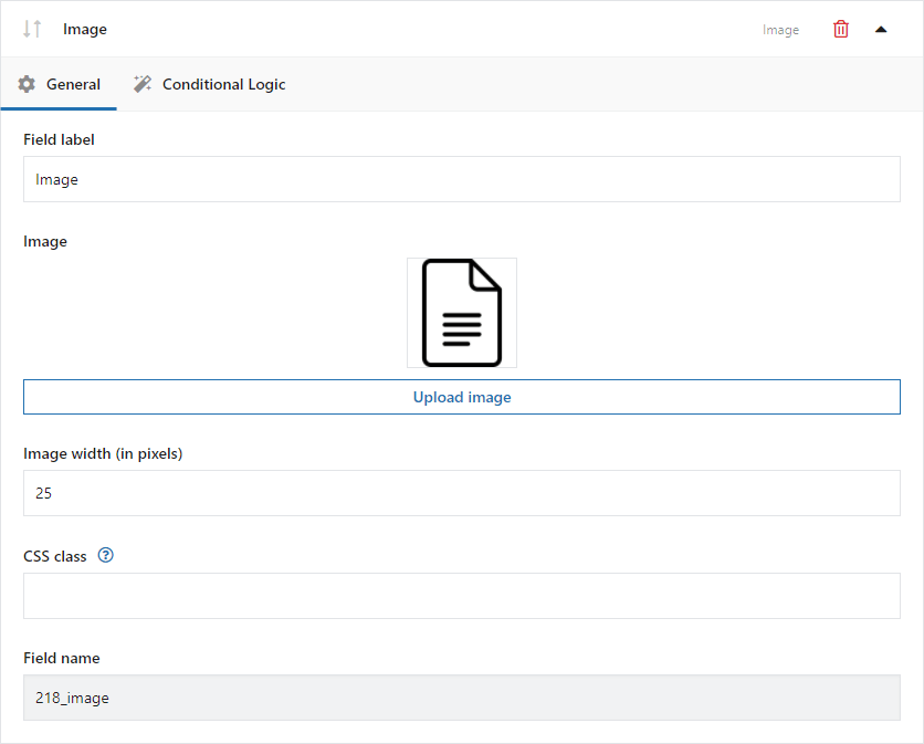
Field label
The field label will appear on the product page.
Upload image
Click this button to select an image.
Image width (in pixels)
Set the width of the inserted image.
CSS Class
You can modify the appearance of the fields on the WooCommerce product page by adding your own CSS class.
HTML
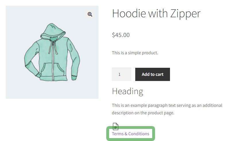
Example of the field type on the product page:
Configuration:
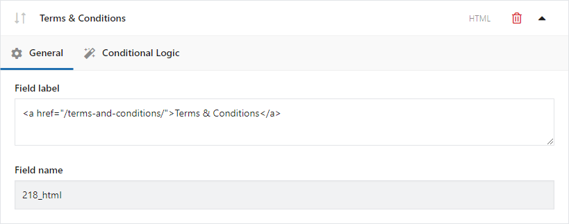
Field label
The field label will appear on the product page.
Integrations with other WP Desk plugins
Flexible Product Fields works with selected WP Desk plugins and add-ons. Integrations let you, among other things, make the field price depend on the product unit quantity, control checkout form fields, and place data entered by the customer on PDF coupons.
Flexible Quantity Calculator for WooCommerce
PRO Flexible Product Fields can calculate the price of an additional field based on the unit quantity passed by Flexible Quantity Calculator for WooCommerce (Flexible Quantity).
The integration can be useful when selling products by meter, kilogram, liter, or square meter. For example, the cost of laminating, a protective coating, or installation can be multiplied by the product area calculated by Flexible Quantity Calculator.
To use the integration, select the Per unit (Flexible Quantity) option in the field price settings.
Add a new template in Flexible Quantity (Unit Calculator) and define its parameters for a specific product.
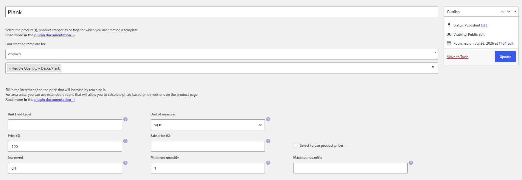
After creating the template, the product will have the appropriate price, increment, minimum quantity, and other settings according to the template you have just created.
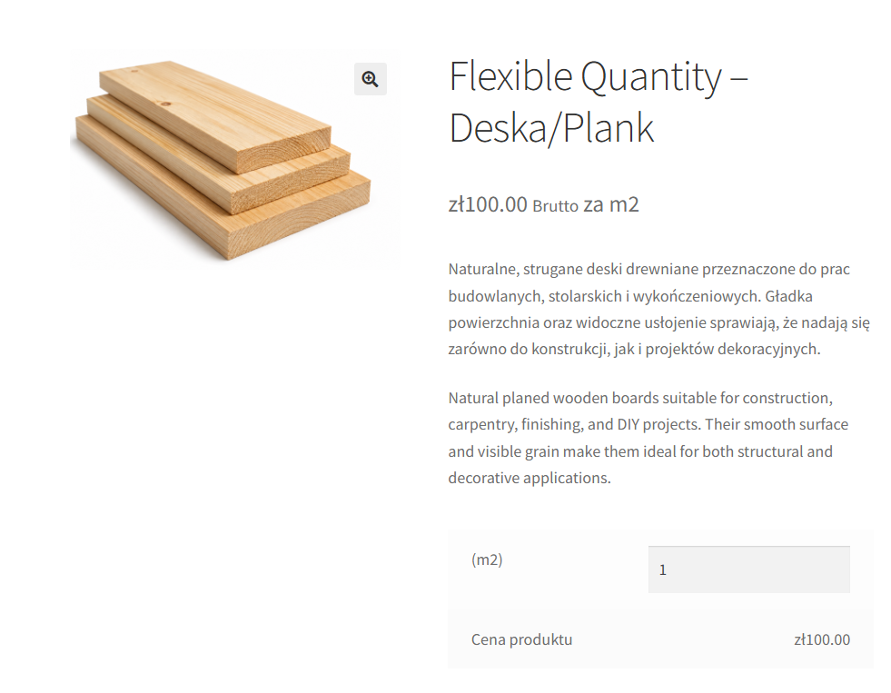
Then create a template in Flexible Product Fields and assign it to the product you have just created.
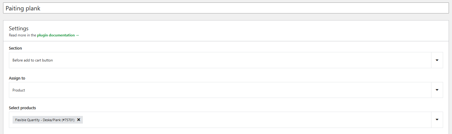
In this case, we added a select field.
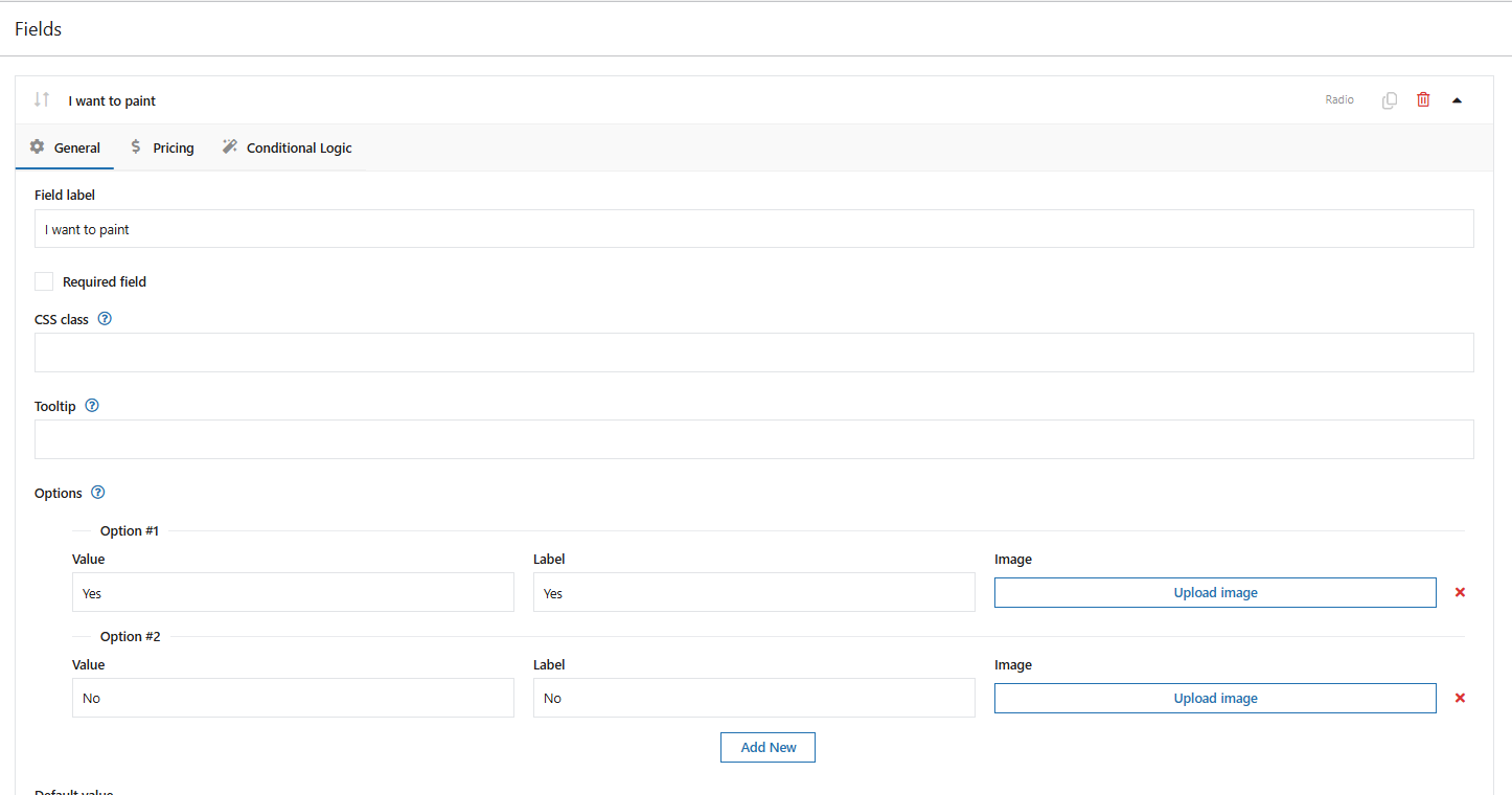
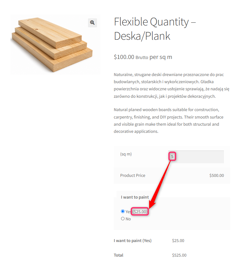
We also defined the price for the additional service. As the calculation type, we selected “Per unit”. The value itself is calculated by the quantity calculator plugin.
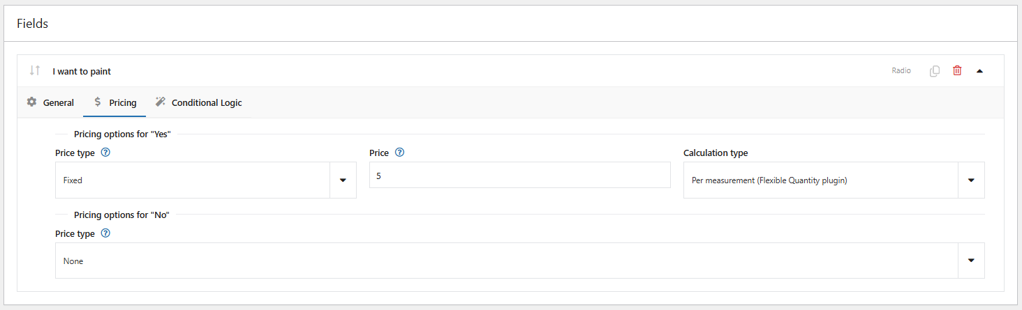
As a result, if the customer chooses an additional option, the price will be calculated proportionally according to the unit calculator. In this case, the more m2, the higher the varnishing price will be, provided the customer selects it.
Learn more about Flexible Quantity Calculator for WooCommerce →
Flexible Checkout Fields PRO
Fields created with Flexible Product Fields can be used in Flexible Checkout Fields PRO conditional logic rules.
Based on the option selected by the customer on the product page, you can show, hide, or set a selected checkout form field as required.
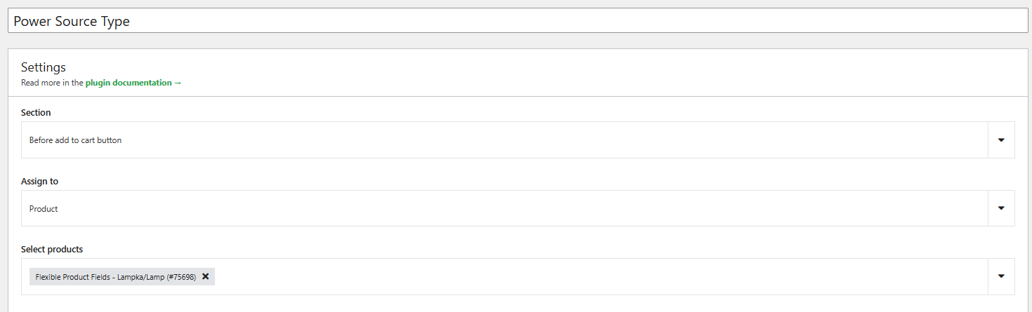
In the first step, add the appropriate fields to a selected product, category, etc. In this example, it will be a specific product.
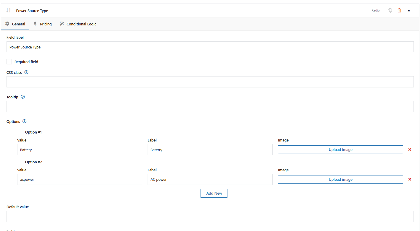
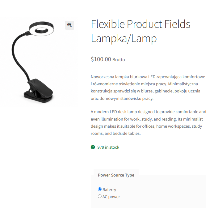
After adding the fields, the product will look as follows:
The next step is to configure a new field using the Flexible Checkout Fields plugin.
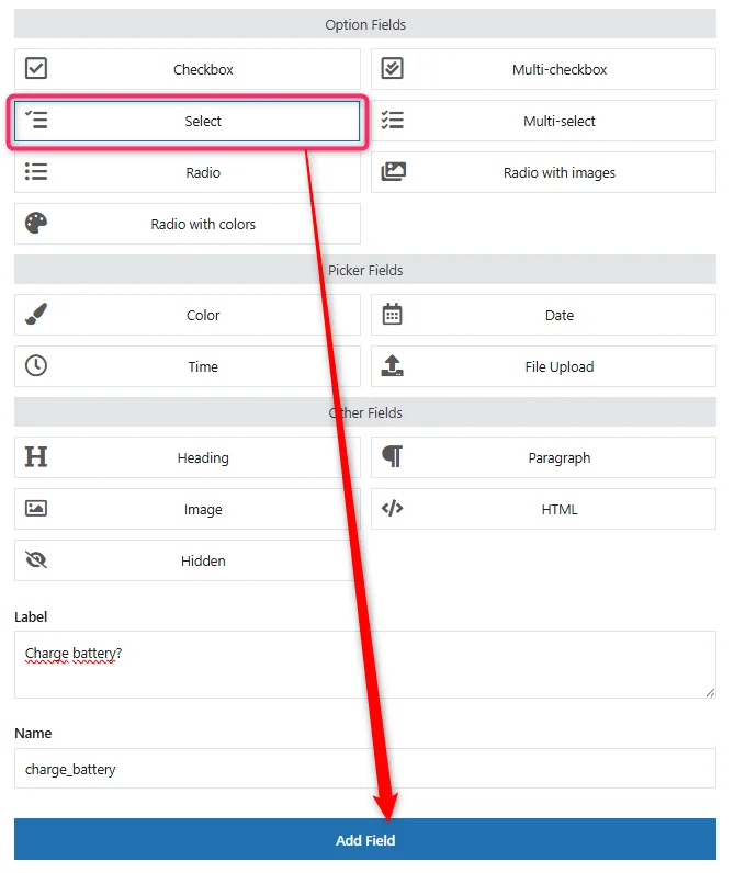
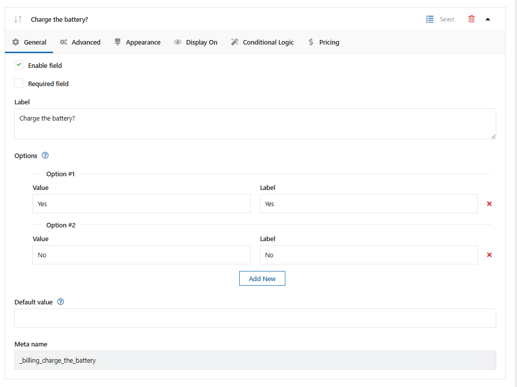
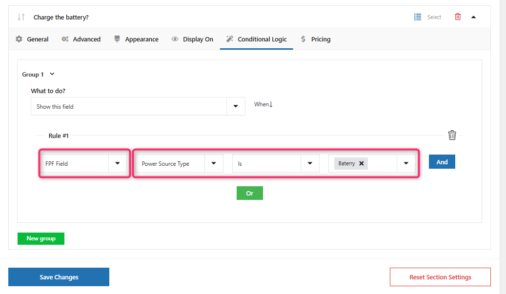
Then configure conditional logic for the specific product in the Flexible Checkout Fields PRO settings. If you want to narrow it down further, as in this use case, you can define a specific option selected by the customer.
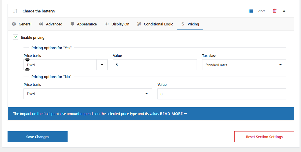
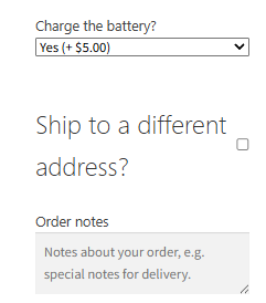
In our case (battery selection), we will also add an extra fee (price) if the customer selects YES.
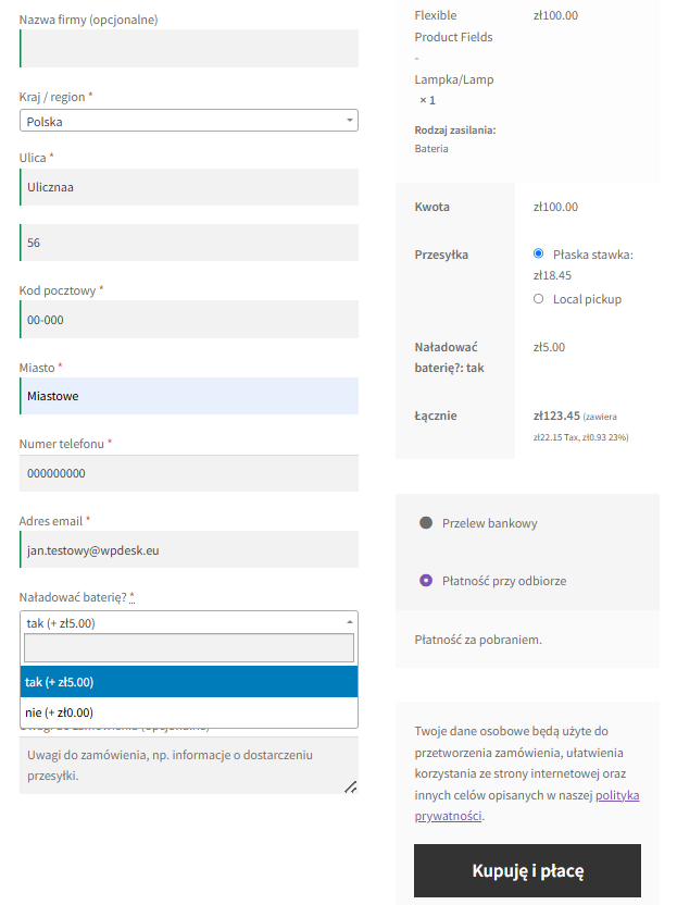
Finally, if the customer selects the appropriate product option (where we added extra fields using Flexible Product Fields), the checkout will show the field configured with conditional logic.
Check the Flexible Checkout Fields conditional logic configuration →
Flexible PDF Coupons PRO – Custom Shortcodes
The Custom Shortcodes add-on can retrieve values from fields created with Flexible Product Fields and place them on a PDF coupon or gift card.
The Flexible Product Fields field must be assigned to a product marked as a PDF coupon. The value entered by the customer can then be displayed in the template using the appropriate shortcode.
You can use the integration to place the following on a gift card, among other things:
- recipient name,
- message or dedication,
- selected gift variant,
- coupon delivery date.
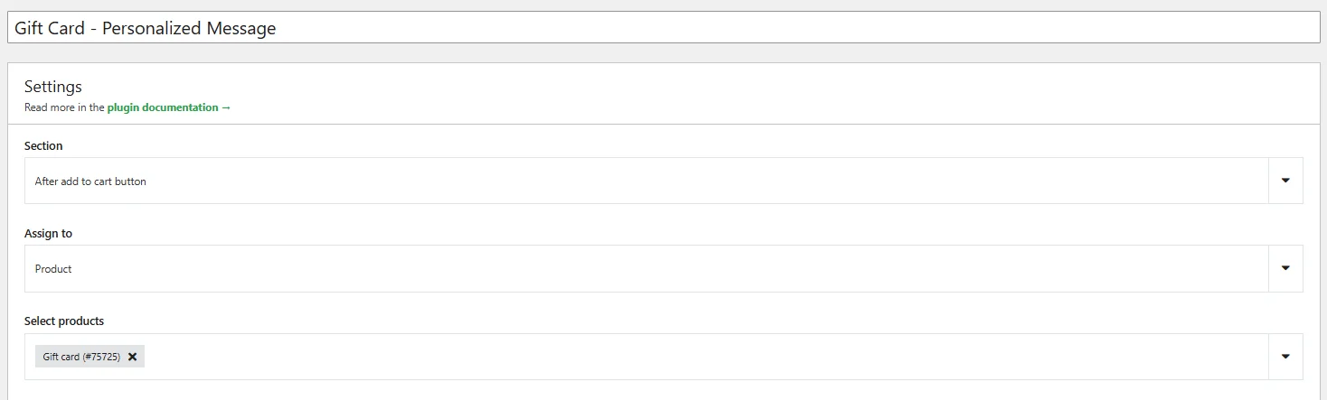
Add a new field using Flexible Product Fields and assign it to the product that is a coupon. In this case, we selected the “textarea” field type because we want the customer to be able to enter the dedication text themselves.
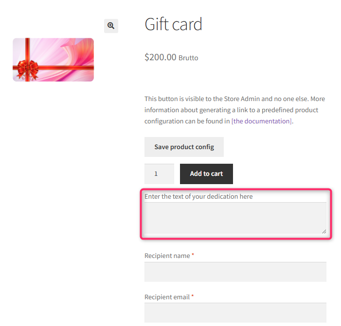
A new field will then appear on the coupon product page, which the customer can complete during purchase.
Next, add the newly created field in the Shortcode add-on settings.
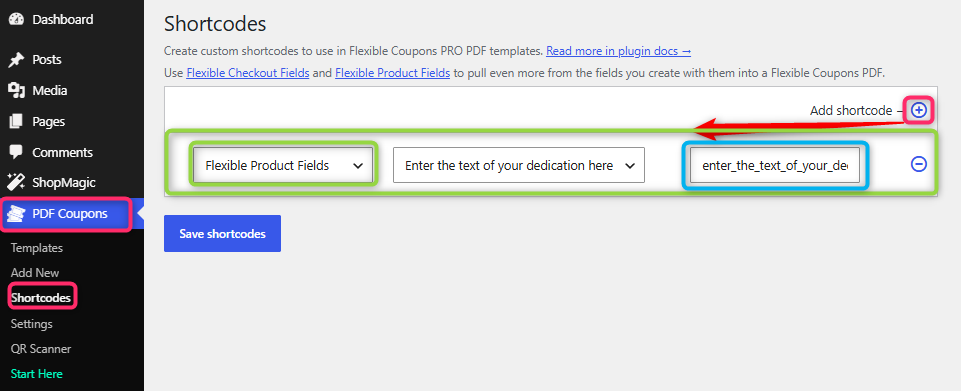
To do this, go to PDF Coupons > Shortcodes.
Then click Add shortcode, select Flexible Product Fields from the dropdown list, and then use the second dropdown list to find the name of the field you have just created. Then save shortcodes.
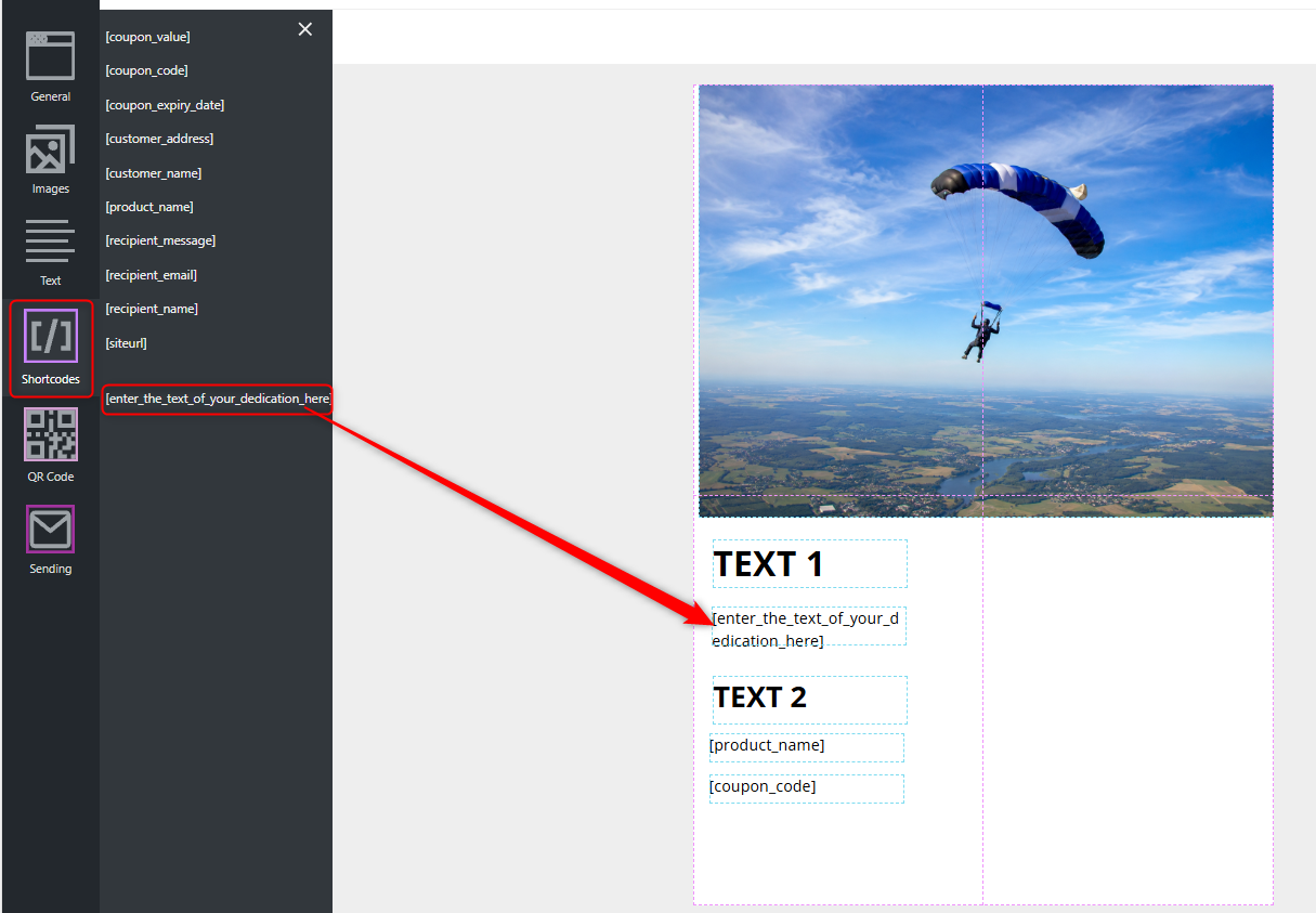
Next, go to PDF Coupons > Templates, select the template you want, find and add the shortcode you have just created. The value in square brackets will be replaced with the text entered by the customer during purchase.
Check the Custom Shortcodes configuration →
Add-ons for Flexible Product Fields
Flexible Product Fields can also be extended with dedicated add-ons:
- Flexible Product Fields – Multistep – divides an extensive product configurator into consecutive steps displayed as an accordion. Go to documentation →
- Flexible Product Fields – Booking Calendar – adds support for available dates, date ranges, seat limits, and time slots. Go to documentation →
Options for advanced users
Save product configuration
An additional button "Save product config" is available on the product subpage. It is located above the "Add to Cart" button and it is visible only to the store administrator. The function enables sending to the customer ready product configurations (e.g. via email).
Clicking on the "Save product config" button will save the current configuration of a given product. The configuration will be available in the form of a URL in the browser bar (the address will appear after reloading the page).
Example of the button on the product page:
It is possible to hide the entire container with CSS. Please go to Appearance > Customize > Additional CSS and paste the code below.
div.fpf-fields-config-wrapper {
display:none!important;
}
Data storage location
Data of created product fields and their settings are saved in the database. They can be used for external integration or customization of the plugin.
Field group definitions
The Fields groups are saved in the posts table as fpf_fields. This post type has additional data in the postmeta table where you can find information about the name of the field and what can be entered inside of it. The record in postmeta will have _fields value entered in the meta_key field. In the post ID, you will find the post ID of the field group.
Field Values
The values of specific fields, i.e. data entered there by the user, are stored in the wp_woocommerce_order_itemmeta table. They are associated with a specific product by order_item_id and the definition of the specific meta_id field.
Getting the field values
The following code can be used to retrieve field values and use them in your functions.
Attention!! The scope of support does not include the development of individual functions, and modifying the source code of the theme is at your own risk.
$fields_by_product = [

// product id

368 => [

'Select', // FPF field label

],

];
// order id
$order = wc_get_order( 664 );
$items = $order->get_items();
$values = [];
foreach ( $items as $item ) {
$order_item_id = $item->get_id();
$product_id = $item->get_data()['product_id'];
if ( isset( $fields_by_product[ $product_id ] ) ) {
$values[ $order_item_id ] = [];
foreach ( $fields_by_product[ $product_id ] as $field_label ) {
$values[ $order_item_id ][ $field_label ] = wc_get_order_item_meta( $order_item_id, $field_label, true );
}
}
}
// ... $values
Change the label of the price field
It is possible to customize the labels that contain the brackets with the price. Paste the appropriate code into the functions.php file. Make a backup of the file before making these changes.
Adding a plus before a price greater than 0
add_filter( 'flexible_product_fields/field_args/label_price', function( $label, $price_raw, $field ) {

if ( $price_raw > 0 ) {

return '(+%s)';

}

return $label;

}, 10, 3 );
Removing the brackets
Paste the field name in place of the field name. The field name is in the field settings under the label name e.g. fpf_5801863.
add_filter( 'flexible_product_fields/field_args/label_price', function( $label, $price_raw, $field ) {

if ( $field['id'] === 'field name' ) {

return '';

}

return $label;

}, 10, 3 );
Extra help
💡 How to translate Flexible Product Fields with WPML
Free vs. PRO Feature Comparison
To make it even easier for you to see the difference between the free and pro versions of the Flexible Product Fields for WooCommerce plugin, we've prepared for you a summary table of all the features. Take a look and decide which version you choose.
| Feature | FREE → | PRO → |
| Showing labels and field values in cart summary and checkout page | ✅ | ✅ |
| Set custom product fields as required or not | ✅ | ✅ |
| Editing options for each placeholder and tooltip | ✅ | ✅ |
| CSS Class support | ✅ | ✅ |
| Assigning a group of custom fields to a specific product | ✅ | ✅ |
| Assigning a group of custom fields to a specific variation | ❌ | ✅ |
| Assigning a group of custom fields to a specific category | ❌ | ✅ |
| Assigning a group of custom fields to a specific tag | ❌ | ✅ |
| Assigning a group of custom fields to all products | ❌ | ✅ |
| Custom product fields: Text, Textarea, Number, E-mail, URL, Checkbox, Multi-checkbox, Select, Multi-select, Radio, Radio with images, Radio with colors, Time, Color, Heading, Paragraph, Image, HTML | ✅ | ✅ |
| Custom product fields: Date, File Upload | ❌ | ✅ |
| Arranging field groups in order | ❌ | ✅ |
| Assigning a fixed or percentage price (of on an initial price) to a field | ❌ | ✅ |
| Conditional logic for fields | ❌ | ✅ |
| Duplicating field groups | ❌ | ✅ |
Worth reading
- https://wpdesk.net/blog/woocommerce-product-personalization-options/
- https://wpdesk.net/blog/flexible-product-fields-woocommerce-incorrect-gross-prices/
- https://wpdesk.net/blog/get-woocommerce-product-url-attribute/
- https://wpdesk.net/blog/color-swatches-woocommerce-products/
- https://wpdesk.net/blog/woocommerce-custom-product-attributes/
- https://wpdesk.net/blog/add-custom-product-fields-woocommerce/
- https://wpdesk.net/blog/wordpress-product-configurator/
- https://wpdesk.net/blog/woocommerce-add-customize-products/